City of tea loyalty card and cup seal design process
- Angela Huang

- Mar 31, 2020
- 2 min read
Updated: Apr 4, 2020
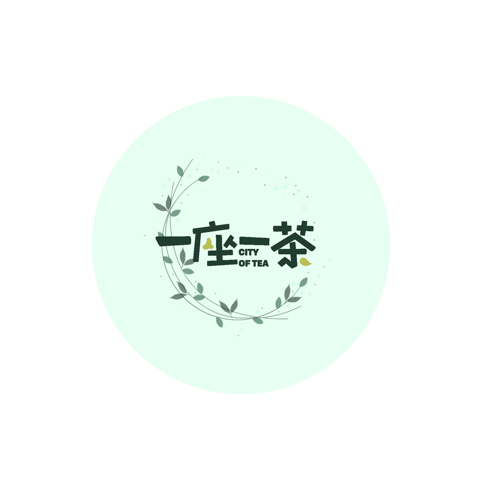
I was given the opportunity to design the loyalty card and cup seal for my sisters franchised milk tea business called 'City of Tea'(一座一茶). This is a company originated from Guangzhou, it is fairly new and still in the process of expanding.
Originally I only needed to make a design for the cup seal however my sister was not satisfied with the style of the design so she decided to change the design.

Some of the problems include:
- The base green colour was too saturated and looks "kind of ill"-quoted from my sister.
- Not satisfied with the font of the text because it looks too harsh.
- The overall look of the design is too industrial looking and doesn't suite the comfortable and relaxing aesthetic of the store.
- The material of the card chosen was too smooth so the stamps wipe of very easily.

Some of the positive points include:
- Information are very clear and easy to understand.
- The store logo is being emphasized.
After research of loyalty cards of other milk tea stores and brainstorm of ideas I came up with the design below.


I shared my design with my sister and got a series of feedback to improve my design.


Here are the little changes I made to get to my finalized design.


I had no reference for the cup seal and there are very limited amount of resource I am able to find online. The only other alternative why I could think of to get inspiration was to go visit local milk tea stores and see what kind of design they are using on their cup seals. Didn't have the budget to buy milk tea from all the stores but I was able to find one common feature that all the stores use, which is simply just using the logo.


So considering there is already the logo printed on the cups, it would be pretty boring to just have the logo on top. Also with the limitations of the colour of the logo, the only suitable background colour that will make the logo stand out is white or clear. So after many days of not knowing where to begin I started doing scrap booking and an idea suddenly struck while I was doodling. So I came up with the design below.

And then I went through the process of getting feedback and improving the design once again.


Finally ended up with this final design.

Interesting content - very visual.